Keryg
Digital Product · UX/UI · Design System
Designing a Scripture-study platform from the ground up around clarity, context and serious learning.
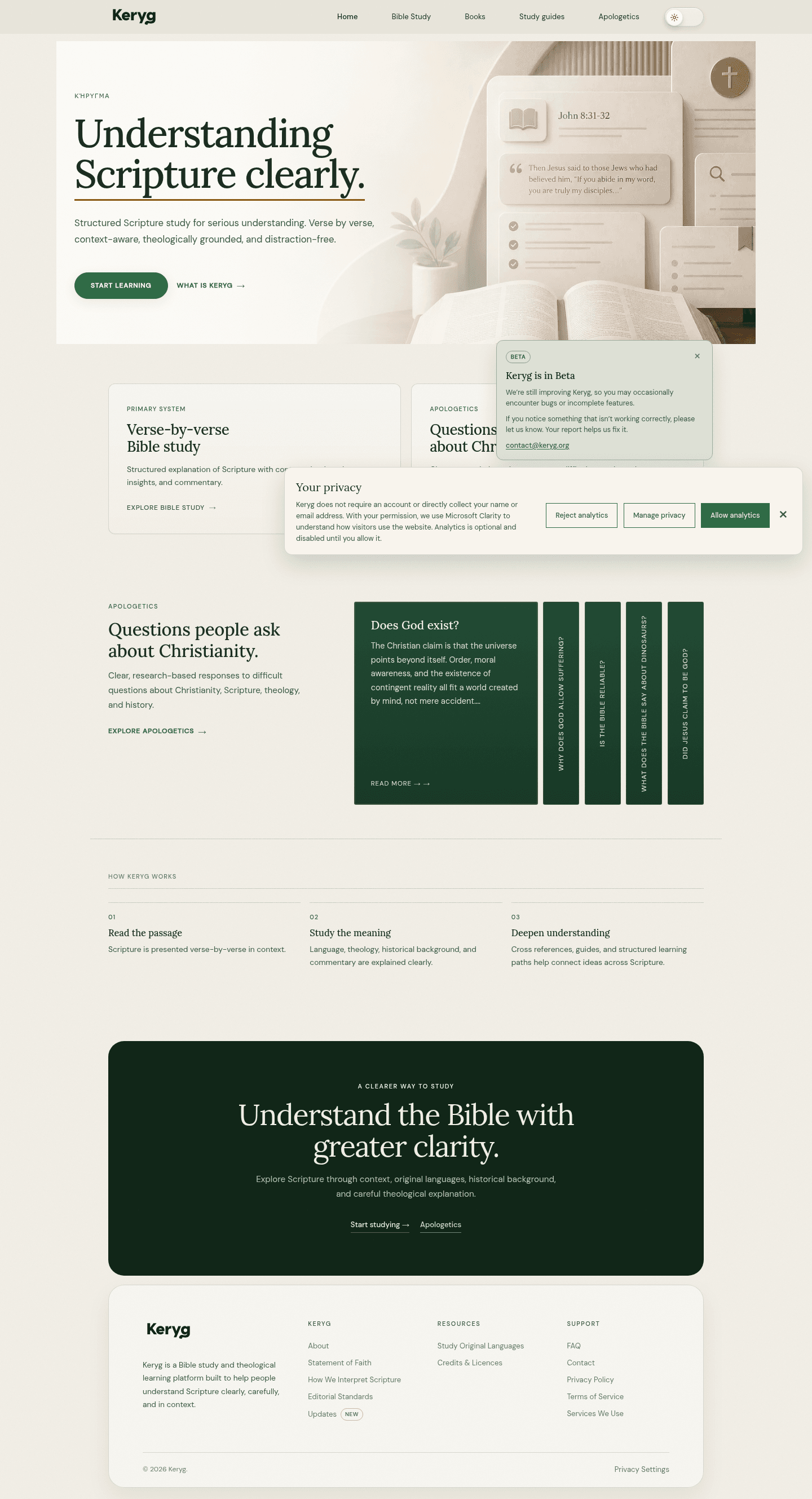
Keryg is a Bible study and apologetics platform designed to help people understand Scripture through careful reading, historical context, original-language tools and structured Christian apologetics.
01 / Overview
A learning system, not just a Bible reader.
Keryg is a Scripture study and apologetics platform built from the ground up for deep, accessible learning. Ivan shaped the information architecture, UX patterns, visual system and product direction so the product could hold different levels of study without losing its centre.
- Project
- Keryg
- Type
- Digital Product
- Role
- Product design · UX/UI · Design system · Development
- Scope
- Product architecture · Responsive UX · Visual system
- Location
- Kampala, Uganda · Global
02 / The challenge
Making deep Scripture study feel approachable.
Bible-study tools can become either too simple for serious study or too dense for ordinary readers. The product challenge was to support depth without turning every screen into an academic interface.
- Read without distractionKeep the biblical text central.
- Go deeper when readyMake context and language tools available by intent.
- Navigate connected materialGive a substantial body of learning a calm structure.
03 / Product architecture
Different intentions, one coherent system.
Keryg separates learning activities by intent so the product can be useful to someone reading a passage and to someone tracing its language, history or argument.
Bible study
Reading, Study and Interlinear modes support progressively deeper engagement with Scripture.
Apologetics
A structured question library helps users explore theology, history, evidence and difficult Christian questions.
Connected learning
Study guides, original-language tools, references and topical content work as related systems.
Responsive foundation
Reusable patterns carry the same hierarchy across desktop and smaller reading contexts.
04 / Key experience
Scripture remains the primary focus.
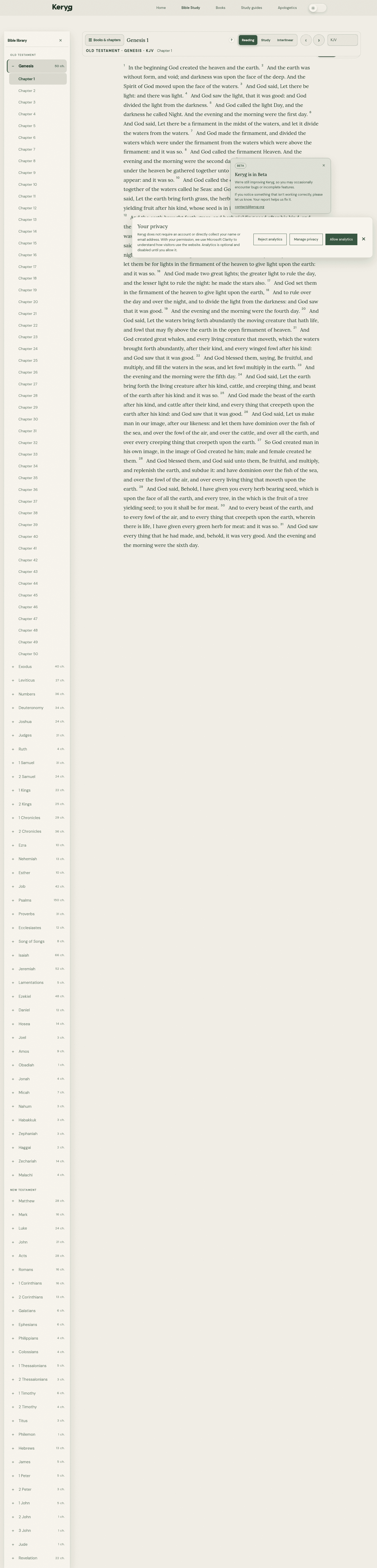
The Bible Reader keeps the reading hierarchy quiet and legible. Navigation, chapter controls and deeper modes are present, but they do not compete with the text itself.
That balance is the central product decision: supporting serious study while letting a reader stay in the passage.
05 / Study depth
Depth by intent, not density by default.
The source documents three Bible-study modes. Each answers a different reason for opening the product.
Stay with the passage.
A focused Scripture-reading state for following the text with minimal interruption.
Bring context closer.
A deeper study state for additional information and connected learning resources.
Explore original language.
An original-language exploration state for readers who want to examine the text more closely.
The approved local Bible Reader image shows the mode switcher. Separate Study Mode and Interlinear Mode screenshots were not present in the fetched source, so no generic or unrelated image is labelled as either mode.
06 / Key experience
A clear starting point for difficult questions.
The Apologetics experience turns a large question library into navigable entry points. Search, categories and curated sections help people start from a question rather than needing to know the whole structure in advance.
The design language stays consistent with Bible study so apologetics feels like part of Keryg, not a separate product bolted on later.

07 / Responsive experience
A system designed to travel across contexts.
The product direction treats responsive behaviour as part of the architecture. Reading, chapter navigation, mode changes and contextual panels need to remain understandable as the available space changes.
Keep the text legible and central at each size.
Retain access to books, chapters and modes without visual noise.
Allow deeper resources to remain related without overwhelming the primary task.
The local approved imagery is desktop/full-page material. A dedicated mobile capture remains an evidence gap for the next asset pass; no mobile-only behaviour is claimed here.
08 / Design decisions
The work was deciding what should appear when.
- 01
Scripture-first hierarchy
The biblical text remains primary; supporting tools are available without becoming the default visual focus.
- 02
Progressive disclosure
Additional context and language tools appear through intentional modes rather than crowding the initial reading state.
- 03
Connected learning resources
Study guides, references, original-language tools and apologetics reinforce one another as parts of one learning system.
- 04
Reusable interaction patterns
A restrained visual language and consistent controls help the product grow without every new experience feeling unrelated.
- 05
Responsive by foundation
Navigation, chapter controls and contextual panels are considered as a system that must adapt across screen sizes.
09 / Takeaway
Keryg is a product-system problem as much as a visual-design problem.
The central design decision was deciding what should be visible now, what should stay contextual, and how to support serious study without overwhelming the reader.
Let’s work together
Have a product or website to design?
Let's turn complex ideas into clear digital experiences.
[email protected]