Meals of Hope
Website Redesign · UX/UI · Nonprofit
Making a nonprofit's mission and ways to get involved easier to understand.
Meals of Hope is a Florida-based nonprofit working to fight hunger through meal-packing events, food pantries and community programmes. I worked on the website redesign to connect its mission, impact and participation paths more clearly.
01 / Overview and contribution
Connect a mission-led organisation with meaningful action.
Meals of Hope brings people together to fight hunger through meal-packing events, food pantries and community programmes. Its website has to carry both sides of that work: explain why the organisation exists and help people find a way to contribute.
I worked on the website redesign and UI/UX direction, shaping a clearer relationship between mission, impact, programmes and participation.
- Project
- Meals of Hope
- Type
- Website Redesign
- Role
- UI/UX · Responsive design
- Industry
- Nonprofit / Community Services
- Location
- Naples, Florida, USA
- Website
- mealsofhope.org ↗
02 / The original experience
The earlier site already carried a substantial mission.
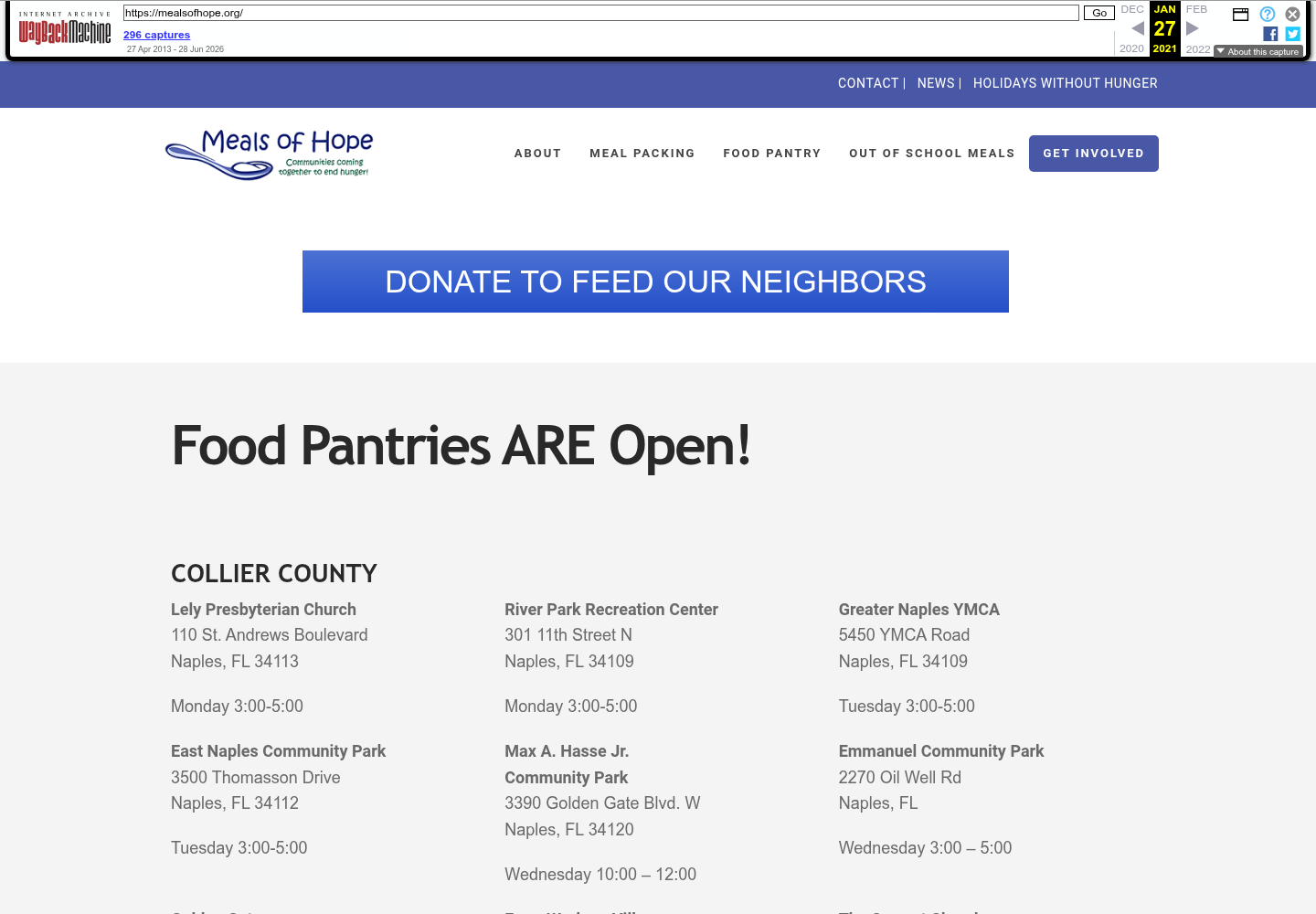
The archived January 2021 homepage presents a familiar nonprofit structure: a compact utility bar, a mission logo, links for About, Meal Packing, Food Pantry, Out of School Meals and Get Involved, followed by a food-pantry-led content area. It is historical context, not evidence that the earlier experience was ineffective.
03 / The design challenge
Connecting the mission with meaningful action.
The approved project source describes a specific information problem: the older site contained strong information, but programmes, volunteering, giving and impact did not yet form a clear participation journey.
Make the purpose immediate
Visitors should understand the organisation's reason for being before they have to interpret its programme structure.
Make impact visible
Impact, stories and programme information need to act as evidence of what participation supports, not disappear behind secondary pages.
Offer an appropriate next step
Packing events, volunteering and giving are different forms of involvement and need distinct, understandable entry points.
04 / Information architecture
Move from understanding the mission to choosing a way in.
This is an editorial explanation of the approved redesign direction, not an invented original sitemap. It shows how the case-study source connects mission, programmes, evidence and calls to action.
- 01
Understand
Lead with the mission and give visitors a clear sense of what the organisation does.
- 02
See the work
Use impact and programme information to show how the mission becomes practical activity.
- 03
Find a programme
Organise meal packing, food pantry and related community information as recognizable paths.
- 04
Get involved
Separate participation routes such as volunteering, giving and event involvement.
05 / Before and after
From programme-led information to a clearer invitation to participate.
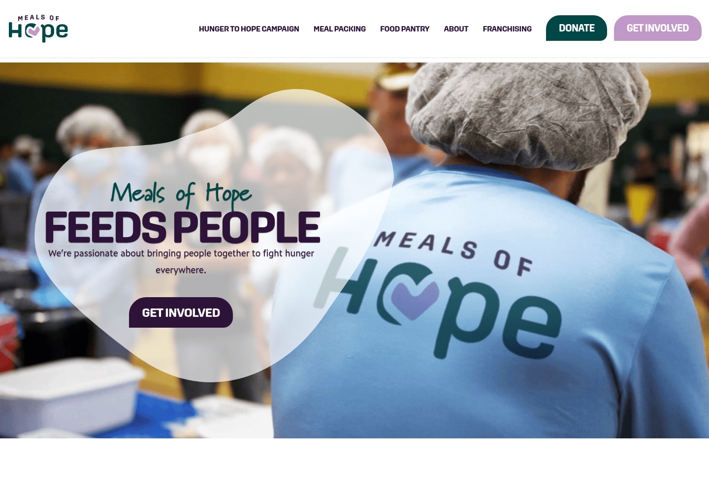
The dated references show a visible shift in emphasis: the archived homepage foregrounds programme navigation and food-pantry information, while the current source leads with community photography, a direct mission statement and a prominent Get Involved action.
Before
After
This comparison establishes visible differences between dated references. It does not prove that Ivan designed every current-site change, that the current site is unchanged from the delivered redesign or that the work produced measurable fundraising, volunteer or community outcomes.
06 / Communicating the mission
Let the organisation's purpose arrive before the request.
The current hero makes the mission the first readable statement: “FEEDS PEOPLE” sits over an image of people preparing meals, followed by a short explanation and a Get Involved action. The combination gives visitors a human context without asking the photograph to carry the whole story.
The wider current page then explains what Meals of Hope is, introduces meal-packing and corporate social responsibility events, and presents who the work helps. Those are current public-site observations; they are not presented as proof that each later section was part of Ivan's original delivery.
Community imagery is used here as local project evidence. Before publication, Ivan should confirm that the image, logo and any identifiable people are approved for portfolio use.
07 / Programme discovery
Give different kinds of community work a readable place.
The approved source names meal-packing events, food pantries and community programmes. The live site also currently exposes after-school meals, corporate social responsibility events and news. The design task is to organize these as intelligible programme paths without implying that the website created the programmes themselves.
Explain participation in action.
Visitors can understand meal packing as a group activity with a practical connection to food support.
Surface local support.
Pantry information represents a different intent from volunteering or donating and needs its own path.
Show the wider system.
Related programmes and updates help the mission feel ongoing rather than limited to a single event.
08 / Ways to get involved
Different actions deserve different invitations.
Volunteering, donating, hosting or joining a meal-packing event and partnering with the organisation each represent a different level and kind of commitment. The redesign direction gives these paths clearer, more consistent entry points instead of treating every visitor as if they arrived with the same intention.
Find a meal-packing or community event pathway.
Understand how to offer time and practical help.
Reach a donation path without confusing it with programme information.
Explore the appropriate organisational or event relationship.
The current website contains donation, newsletter and programme links. Their presence today is current product context; the available evidence does not establish that every destination or later integration was part of Ivan's delivered redesign.
09 / Visual system and imagery
Use warmth and structure together.
The current visual evidence pairs a warm community photograph with a strong brand lockup, a simple headline and high-contrast actions. The redesign direction uses typography, spacing and repeated content blocks to make a mission-led site feel approachable without losing navigational clarity.
Show people doing the work.
Authentic programme imagery gives participation a concrete, human context.
Lead with purpose.
A concise mission statement gives visitors a clear orientation before supporting detail.
Repeat the paths that matter.
Distinct, consistent calls to action help volunteering, giving and events remain findable.
10 / Responsive experience
Keep the mission legible at every size.
Responsive design was part of the documented scope. The primary mission, supporting explanation and first action should remain readable when a wide hero becomes a narrow screen and utility navigation becomes a compact menu.
Keep the mission and first meaningful action ahead of secondary programme detail.
Preserve enough of the people and activity in the image for it to remain contextual rather than decorative.
No dedicated approved Meals of Hope mobile screenshot is currently stored, so this page does not claim a captured mobile implementation.
11 / Design decisions
The redesign connects emotional context with practical action.
- 01
Mission first
Problem: A visitor should not have to infer why the organisation exists from its programme menu. Decision: Establish the purpose and the human context before asking people to choose an action.
- 02
Impact as evidence
Problem: Participation is easier to understand when people can see what the work supports. Decision: Give impact, programme explanation and current organisational context a visible role in the story.
- 03
Different paths for different commitments
Problem: Volunteering, donating and joining an event are not interchangeable intentions. Decision: Give each a distinct but consistent entry point.
- 04
Warmth with hierarchy
Problem: Community photography can create emotion but cannot organize a substantial nonprofit site by itself. Decision: Pair authentic imagery with restrained type, spacing and repeatable content patterns.
12 / Takeaway
A nonprofit website works hardest when the feeling and the next step are connected.
The Meals of Hope redesign is grounded in a simple product-design principle: make the mission clear, show how the work becomes real and then help each visitor find an appropriate way to participate. The evidence supports that direction; it does not support claims about fundraising, volunteer growth or social impact caused by the redesign.
Let’s work together
Need a website that helps people understand your mission?
Let's create a digital experience that connects what you do with the people who want to take part.
[email protected]