Carolina Skiff
Website Redesign · UX/UI · Responsive Design
Making a boat manufacturer's product range easier to explore.
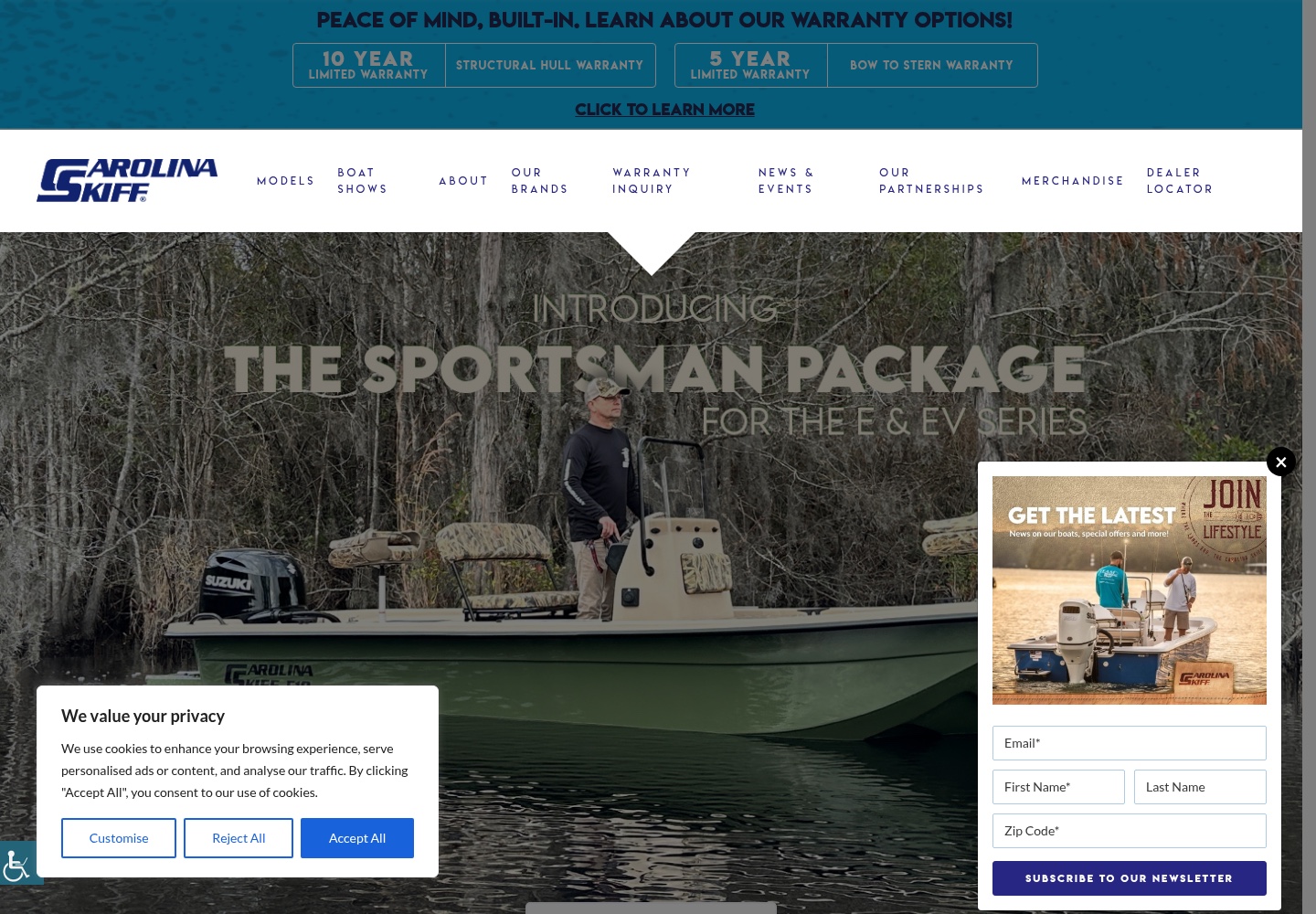
Carolina Skiff is a U.S. boat manufacturer with a broad model range. I worked on the website redesign to make model discovery clearer, connect products with real use cases and bring actions such as Build a Boat, Find a Dealer and catalogue exploration closer to the product journey.
01 / Overview and contribution
Turn a large catalogue into a clearer product journey.
Carolina Skiff makes fishing and cruising boats across a broad model range. The website needs to do more than show boats: it needs to help visitors understand where to begin, connect models with the ways they may be used and surface a relevant next step.
- Project
- Carolina Skiff
- Type
- Website Redesign
- Role
- Website redesign · UI/UX · Responsive design
- Industry
- Marine / Boat Manufacturing
- Location
- Waycross, Georgia, USA
- Website
- carolinaskiff.com ↗
02 / The original experience
A catalogue already rich in models, series and specifications.
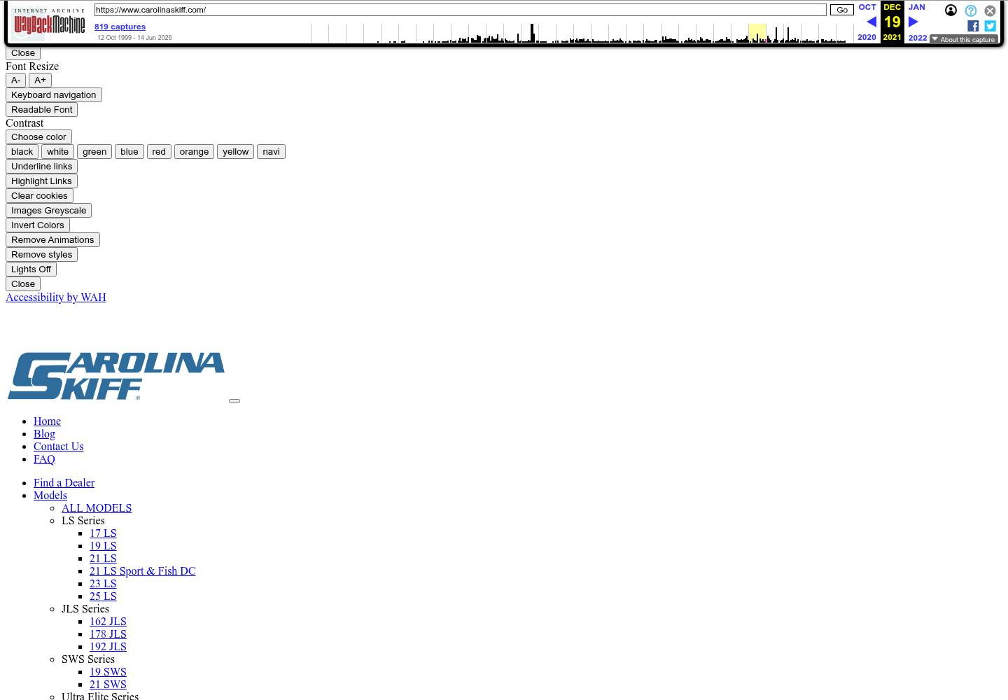
The archived December 2021 homepage exposes a substantial model catalogue, with series such as LS, JLS, SWS and Ultra Elite, individual model links, specifications and Build a Boat actions. It is historical context for the redesign—not evidence that the earlier site was unsuccessful.
03 / The design challenge
Helping visitors navigate a substantial product range.
The approved project source identifies a familiar tension: the older site already contained a broad catalogue, but model discovery, lifestyle storytelling and configuration actions could be connected more clearly.
Find a relevant starting point
Visitors may arrive looking for a model, a use case or a dealer. The experience needs to support those different entry points.
Make the range understandable
Series, model names, photography and specifications need a readable hierarchy rather than a catalogue that asks visitors to decode it first.
Keep action near discovery
Build a Boat, Find a Dealer and catalogue exploration belong close to the point where a visitor is evaluating a product.
04 / Information architecture
Organise the catalogue around how people want to explore.
The structure below is an editorial explanation of the approved project direction, not an invented original sitemap. It connects product discovery to the supporting information and actions visible in the project evidence.
- 01
Explore by model
Start with the catalogue and move into a series or individual boat.
- 02
Explore by use
Use lifestyle and activity cues to make the range more relatable.
- 03
Understand the boat
Read model descriptions, specifications and supporting product information.
- 04
Choose a next step
Build a Boat, find a dealer or request a catalogue when the visitor is ready.
05 / Before and after
From catalogue depth to a more legible product story.
The dated references show an observable shift in emphasis: the archived site exposes a very deep model list and repeated specification blocks, while the current local source gives the hero, model navigation, warranty message and lifestyle presentation more deliberate visual weight.
Before
After
This comparison establishes visible differences between dated references. It does not prove that Ivan designed every current difference, that the current site is unchanged from the delivered redesign or that the work produced measurable sales, dealer leads or conversion impact.
06 / Product and model discovery
Let the range be explored by intent, not only by model number.
The approved design direction introduces another way into the catalogue through real use cases such as Family, Fishing and Fun. That framing complements model-led browsing without inventing filters, comparisons or a configurator that the evidence does not establish.
Give the catalogue a clear spine.
Series and model names remain useful for visitors who already know what they are looking for.
Connect boats with real use.
Family, fishing and fun provide a more human entry point into a substantial product range.
Let the boat explain itself.
Large product and lifestyle imagery gives visitors a faster sense of context before specifications take over.
07 / Product detail and information
Bring the next decision closer to the product.
In the archived experience, individual models sit alongside overview, specifications, features and gallery links, with a Build a Boat action near the product information. That relationship is important: product detail should answer questions while keeping the path forward visible.
Use model descriptions and photography to establish what the boat is for.
Keep specifications and features available for visitors who need more detail.
Place configuration, dealer or catalogue actions close to the evaluation moment.
The current public site contains later content and models whose relationship to Ivan's delivered work is not independently established. This case study treats those surfaces as current product context.
08 / Visual system and photography
Use marine imagery to make a broad range feel tangible.
The evidence gives boats, water and lifestyle photography a central role. Typography, spacing and consistent product patterns then create the hierarchy that lets imagery lead without making product information disappear.
Show the context of ownership.
Boat imagery makes a model more legible as an experience, not only a name in a list.
Separate discovery from detail.
Let the hero and model previews invite exploration before specifications support evaluation.
Repeat what helps comparison.
Consistent model, information and action patterns help the catalogue scale without becoming unrelated pages.
09 / Responsive experience
Keep a wide product range readable on smaller screens.
Responsive design was part of the documented scope. A catalogue of models, images, specifications and calls to action needs to re-order rather than simply shrink, so the primary product path remains understandable on a phone.
Keep the model or use-case entry point ahead of supporting detail.
Preserve enough of the boat and its context for the image to remain useful.
No dedicated approved Carolina Skiff mobile screenshot is currently stored, so this page does not claim a captured mobile implementation.
10 / Design decisions
The redesign decisions connect range, context and action.
- 01
Explore by intent
Problem: A large model catalogue can ask visitors to know the product before they understand the range. Decision: Add Family, Fishing and Fun as use-case-led entry points.
- 02
Keep action near product
Problem: Configuration and dealer steps can feel disconnected from evaluation. Decision: Bring Build a Boat, dealer and catalogue routes closer to the product journey.
- 03
Use lifestyle storytelling
Problem: Specifications alone do not communicate how a boat fits into a person's plans. Decision: Give marine and lifestyle imagery enough scale to make the range tangible.
- 04
Create repeatable catalogue patterns
Problem: Many models need consistency without feeling like one undifferentiated list. Decision: Repeat model, detail and next-step patterns across the range.
11 / Takeaway
A catalogue becomes easier to use when product, context and action travel together.
The Carolina Skiff redesign was about making a substantial product range feel navigable: start with a model or a use case, understand the boat, then move toward configuration, a dealer or a catalogue. The available evidence supports that design direction; it does not support claims about sales or lead performance.
Let’s work together
Need a website that makes your products easier to explore?
Let's create a digital experience that helps people understand a broad product range and choose a useful next step.
[email protected]