BBX Capital
Website Redesign · UI/UX · Responsive Design
Modernising the digital presence of a diversified Florida holding company.
A redesign direction for a Florida-based diversified holding company, moving an older corporate experience toward clearer hierarchy, stronger portfolio storytelling and a more contemporary responsive presentation.
01 / Overview and contribution
A corporate story with several businesses behind it.
BBX Capital is a Florida-based diversified holding company with interests across real estate, consumer businesses and manufacturing. I worked on the website redesign and UI direction, helping move the older corporate experience toward a clearer, more contemporary and responsive presentation.
- Project
- BBX Capital
- Type
- Website Redesign
- Role
- Website redesign · UI/UX · Responsive design
- Industry
- Finance
- Location
- Fort Lauderdale, Florida, USA
- Website
- bbxcapital.com ↗
02 / The original experience
Start with what the earlier site already made visible.
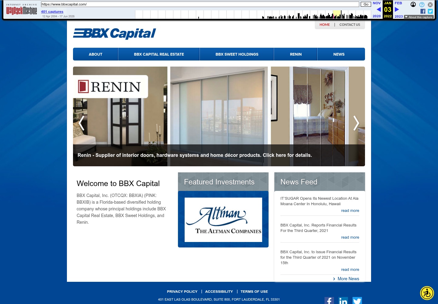
The archived homepage introduced BBX Capital through its principal holdings, featured investments and news feed. Its navigation separated corporate, real-estate, sweet-holdings, Renin and news areas.
03 / The design challenge
Making a diversified business easier to understand.
The older site communicated the company, but the project documentation identifies a dated visual hierarchy, a portfolio structure that needed clearer organisation and a corporate story that required more effort to scan.
Clarify the holding-company story
Give the corporate proposition a more direct entry point before asking people to explore individual businesses.
Make principal businesses easier to understand
Present the portfolio as a set of related interests with clearer hierarchy and more deliberate content groupings.
Create patterns that can travel
Modernise the interface while preparing reusable responsive structures for holdings, news and supporting corporate content.
04 / Information architecture
From corporate introduction to portfolio exploration.
The redesign work reframed the relationship between the company, its principal businesses, property information and news. This is a content hierarchy inferred from the approved case-study narrative and the dated website evidence, not a claim about the site's internal technical architecture.
- 01
Position
Lead with a direct explanation of BBX as a diversified Florida holding company.
- 02
Portfolio
Make principal businesses and operating interests easier to find and compare.
- 03
Property
Give property information a more intentional place within the broader corporate story.
- 04
News
Keep company updates available as supporting evidence rather than the first thing to decode.
05 / Before and after
The visible shift is one of emphasis.
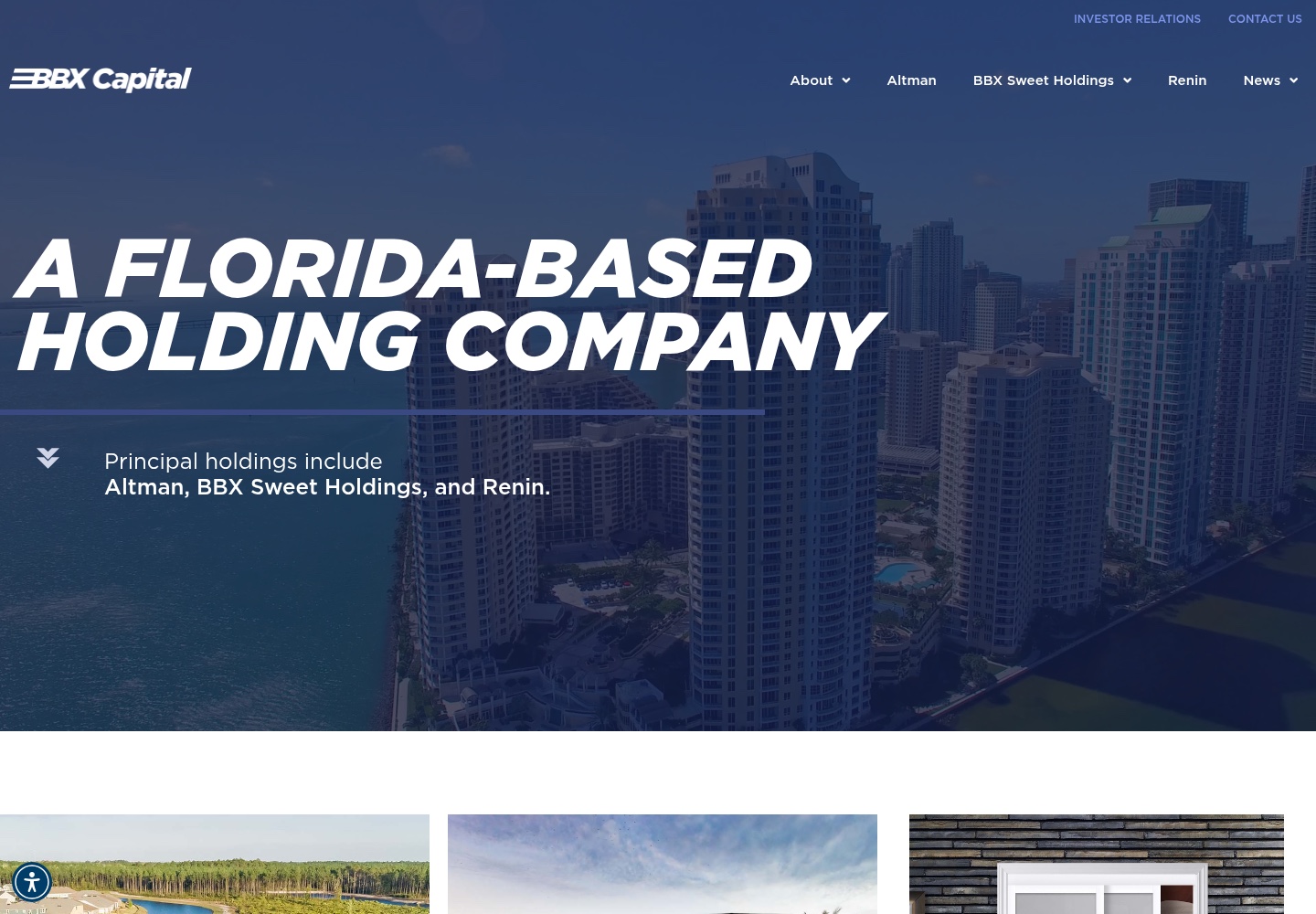
The two dated images show how the experience moved from a dense, blue portal with several competing entry points toward a more spacious, image-led introduction to the company and its holdings.
Before
After
This comparison establishes visible differences between two dated references. It does not prove that every difference was solely created by Ivan, that the current site is unchanged from the delivered version or that the redesign produced a measurable business result.
06 / Visual system
Give the corporate story room to breathe.
The approved redesign narrative points to stronger typography, larger imagery and more deliberate spacing. Together, these choices establish a clearer reading order: understand the company first, then move into its businesses, property interests and supporting updates.
One proposition first.
A direct corporate statement gives the homepage a clear beginning.
Use place and scale.
Large imagery gives the Florida context and business portfolio a more visible role.
Separate the layers.
More breathing room helps corporate, portfolio, property and news content read as related but distinct.
07 / Responsive experience
A clearer system should hold at every size.
Responsive design was part of the documented scope. The redesign direction treats the homepage's proposition, business groupings and supporting content as repeatable structures rather than one fixed desktop composition.
Keep the corporate introduction ahead of portfolio and supporting content when the layout becomes a single column.
Preserve readable type and image context instead of shrinking a multi-column desktop view into an unusable strip.
Carry consistent treatments for holdings, property information and news across responsive layouts.
No dedicated mobile BBX screenshot is currently stored in the approved local asset set. This section records the documented responsive-design scope and does not claim a specific mobile implementation beyond the available evidence.
08 / Design decisions
The redesign decisions were about what to clarify first.
- 01
Lead with corporate positioning
Problem: A diversified holding company can be difficult to place quickly. Decision: Start with a direct proposition that explains BBX before introducing its portfolio.
- 02
Make the portfolio a navigable story
Problem: Principal businesses and interests compete for attention. Decision: Organise them into clearer groups with a more deliberate hierarchy.
- 03
Use imagery to establish context
Problem: Corporate information can become abstract and text-heavy. Decision: Give place, scale and portfolio content a stronger visual role.
- 04
Design reusable responsive patterns
Problem: A redesign can become a collection of isolated pages. Decision: Prepare repeatable structures for holdings, news and supporting corporate content.
09 / Takeaway
A clearer corporate presence starts by making the relationships visible.
The BBX redesign was less about adding more content and more about making a complex corporate story feel simpler, more current and easier to navigate. The evidence supports that design direction; it does not support claims about conversion, traffic or commercial impact.
Let’s work together
Need a clearer digital presence?
Let's create a website that helps people understand your business and what matters most.
[email protected]