ROPTIA
Digital Product · PropTech · Product Design
Taking a PropTech concept from a pre-launch website to a multi-sided property platform.
ROPTIA is a property-technology platform intended to connect renters, owners, buyers and property-industry businesses. Ivan worked on the product and interface design as the concept developed from an early website into a broader marketplace with property discovery, services, profiles and communication.
01 / Overview
A property idea becoming a connected product system.
ROPTIA is described in the approved case-study source as an all-in-one property technology platform. The design work followed the concept as it expanded beyond a waiting-list website into an experience that could hold discovery, services, profiles and communication.
- Project
- ROPTIA
- Type
- Digital Product
- Role
- Product design · UI/UX · Web platform
- Focus
- Property discovery · Platform structure · Reusable patterns
- Market
- United Kingdom
- Website
- roptia.com ↗
02 / The original concept
Start with a proposition people could understand.
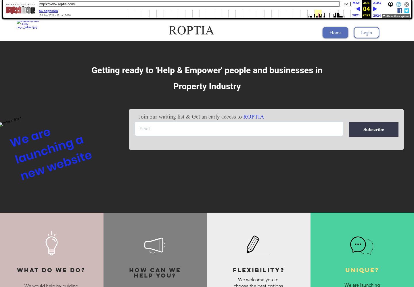
The archived July 2022 experience was explicitly a pre-launch site. It invited people to join a waiting list, introduced ROPTIA as a way to help and empower people and businesses in the property industry, and explained that the team was preparing a new website.
The page also pointed toward guidance through a property journey and the ability to list a property for sale or let. That was enough to establish the idea; a broader product still needed structure for the different journeys behind it.
03 / The product challenge
Designing for more than one property journey.
The source frames the challenge as moving from an idea and interest-capture page to an information architecture capable of supporting several user types and a growing property ecosystem.
Different intentions
Renters, owners, buyers and property-industry businesses may arrive with different reasons for using the platform.
One connected ecosystem
The product needs shared patterns without pretending every participant has the same task.
Room to expand
Discovery, services, neighbourhoods and new property categories need a system that can grow beyond one landing page.
Audience and scope language here follows the approved ROPTIA case study. It describes the product direction; it does not claim that every audience or current feature was solely Ivan’s deliverable.
04 / Information architecture
Make discovery the organising idea.
The approved product-system description identifies search and discovery, a multi-sided marketplace and reusable patterns as the foundation for the wider platform.
- 01
Discover
Property and business search become primary interactions rather than an explanatory afterthought.
- 02
Evaluate
Listings, profiles and neighbourhood information give people more context around a decision.
- 03
Connect
Communication and business discovery connect participants inside the property ecosystem.
- 04
Extend
Reusable structures can support new categories, locations and related services.
This is an editorial map of documented product areas, not an internal technical architecture.
05 / The progression
Concept → platform.
The strongest evidence is the change in what the experience has to organise: from introducing the idea and collecting interest to supporting discovery across property and service categories.
This comparison shows product-scope progression. It does not imply that every visible difference was solely created by Ivan or that the current capture is a complete historical record of the platform.
06 / Key experience
Property discovery becomes the first question.
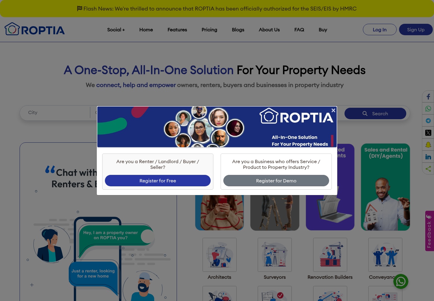
The current public platform places a search surface near the top of the homepage and brings property categories, trending property and premium properties into the same broad discovery context.
The design emphasis is on helping people move from a broad property need toward something they can examine: a listing, a location, a profile or a next conversation. The browser-verified current site shows these surfaces; attribution for every current element remains outside the evidence available here.
07 / Services and businesses
A property platform also has to make the surrounding ecosystem legible.
The approved source describes ROPTIA as connecting property-industry businesses as well as renters, owners and buyers. In the current public experience, business categories and sponsored businesses sit alongside property discovery.
Service and product providers are presented as discoverable parts of the property journey.
Repeated category structures help a broad set of businesses remain understandable within one platform.
Current public pages provide product context; they do not by themselves prove the full release status or original attribution of every marketplace feature.
08 / Connected platform
Connect the next step without collapsing the journey.
The current public product context extends beyond listings. Profiles, communication, neighbourhood information and document-related messaging all point to a wider property ecosystem.
People and businesses have a more recognisable context than a standalone listing can provide.
The public experience includes routes for direct contact and conversations around property or business discovery.
Location-based information gives the property journey a place-based layer beyond the listing itself.
The public homepage describes a digital-vault concept; its detailed implementation and attribution are not established by this case study.
These are current-platform observations and approved source descriptions. They are not presented as a complete inventory of Ivan’s original design scope.
09 / Design decisions
The work was making a growing product understandable.
- 01
Organise around intent
Separate property discovery, business discovery and connected resources so people can begin with the reason they came.
- 02
Make discovery central
Search, categories and listing context give the platform a usable starting point beyond an explanatory landing page.
- 03
Use reusable structures
Listings, profiles, services and neighbourhoods can share familiar patterns while representing different kinds of information.
- 04
Design for multiple participants
Owners, renters, buyers and businesses can belong to one ecosystem without being reduced to one generic user journey.
- 05
Extend the early proposition
The broader interface system carries the early promise of help and empowerment into a product people can explore.
10 / Responsive experience
The platform has to stay navigable as the system grows.
The responsive direction keeps the primary discovery task legible, lets the comparison and editorial evidence stack naturally, and preserves clear text line lengths on smaller screens.
Keep the search and category context readable without forcing a desktop-width control strip.
Contain full interface screenshots so important product details remain visible instead of being aggressively cropped.
Move from concept to challenge to platform areas in one clear vertical sequence.
No dedicated mobile ROPTIA capture was available in the approved local source set. This section documents the case-study page’s responsive treatment without inventing mobile product behaviour.
11 / Takeaway
The central challenge was moving from presenting a property concept to organising a product.
ROPTIA’s story is a progression from a pre-launch proposition to a broader platform with different audiences, discovery journeys and service categories. The available evidence supports that product-direction story; it does not support claims about commercial outcomes or sole attribution for every current surface.
Let’s work together
Building a product with multiple moving parts?
Let's turn it into an experience people can understand and use.
[email protected]