Stronghill Capital
Website Redesign · UI/UX · Responsive Design
Restructuring a commercial lending website around clearer products, audiences and conversion paths.
Stronghill Capital is a commercial real-estate lender. I worked on the website redesign to make its lending products, property types, transaction proof and calls to action easier for brokers and borrowers to understand.
01 / Project overview
Make the lending story easier to enter.
Stronghill Capital presents commercial real-estate lending for brokers and borrowers. The redesign work focused on the website as a decision-support surface: visitors need to understand the lender, distinguish relevant products and find a credible next step without having to decode the whole business first.
- Project
- Stronghill Capital
- Type
- Website Redesign
- Role
- Website redesign · UI/UX · Responsive design
- Industry
- Finance / Commercial lending
- Location
- Austin, Texas, USA
- Website
- stronghill.com ↗
02 / The original website
Start with the lending proposition already in view.
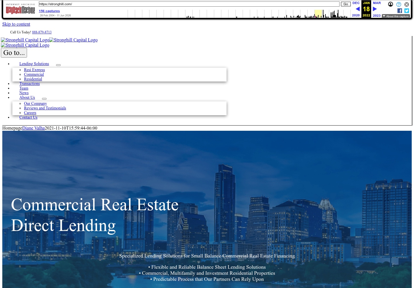
The archived January 2022 homepage introduced Stronghill through commercial real-estate direct lending, a set of lending-solution links, transactions, team, news and company information. The preserved capture also shows the limits of the archived asset load: several logos and interface images are broken in the historical rendering.
03 / The design challenge
Making complex lending options easier to navigate.
The project documentation describes an older experience that mixed company information, lending products and transaction examples without a strong decision path for different audiences. The work therefore had to make the business more legible while keeping the credibility signals that matter in a lending context.
Different audiences
Brokers and borrowers may arrive with different levels of familiarity and different questions to answer.
Product distinctions
Commercial and DSCR lending need clear explanations and routes that help visitors orient themselves.
Proof and action
Transaction proof, product detail and calls to action need to sit in a sequence that supports evaluation.
04 / Audience and product paths
Organise the journey around intent.
The approved case-study source identifies brokers and borrowers, commercial and DSCR lending, property types and transaction proof as the information that needs to become easier to understand. The map below is an editorial explanation of that content relationship, not a claim about the site's internal technical architecture.
- 01
Who is arriving?
Broker or borrower needs a relevant entry point.
- 02
What is needed?
Commercial, DSCR or property-specific lending context.
- 03
Why trust it?
Company information and transaction proof add context.
- 04
What next?
A clear contact or enquiry path supports action.
05 / Information hierarchy
Let visitors understand the offer before they commit to a path.
The redesign direction brings the company's positioning, lending-product distinctions and proof points into a more deliberate order. Navigation can then act as a guide rather than a list of everything the business does.
State what Stronghill does and who it serves before introducing deeper product detail.
Group lending information around recognizable decisions instead of requiring visitors to scan unrelated content.
Place transaction examples and calls to action close enough to the product story to support an informed enquiry.
06 / Before and after
From a lending portal to a clearer decision journey.
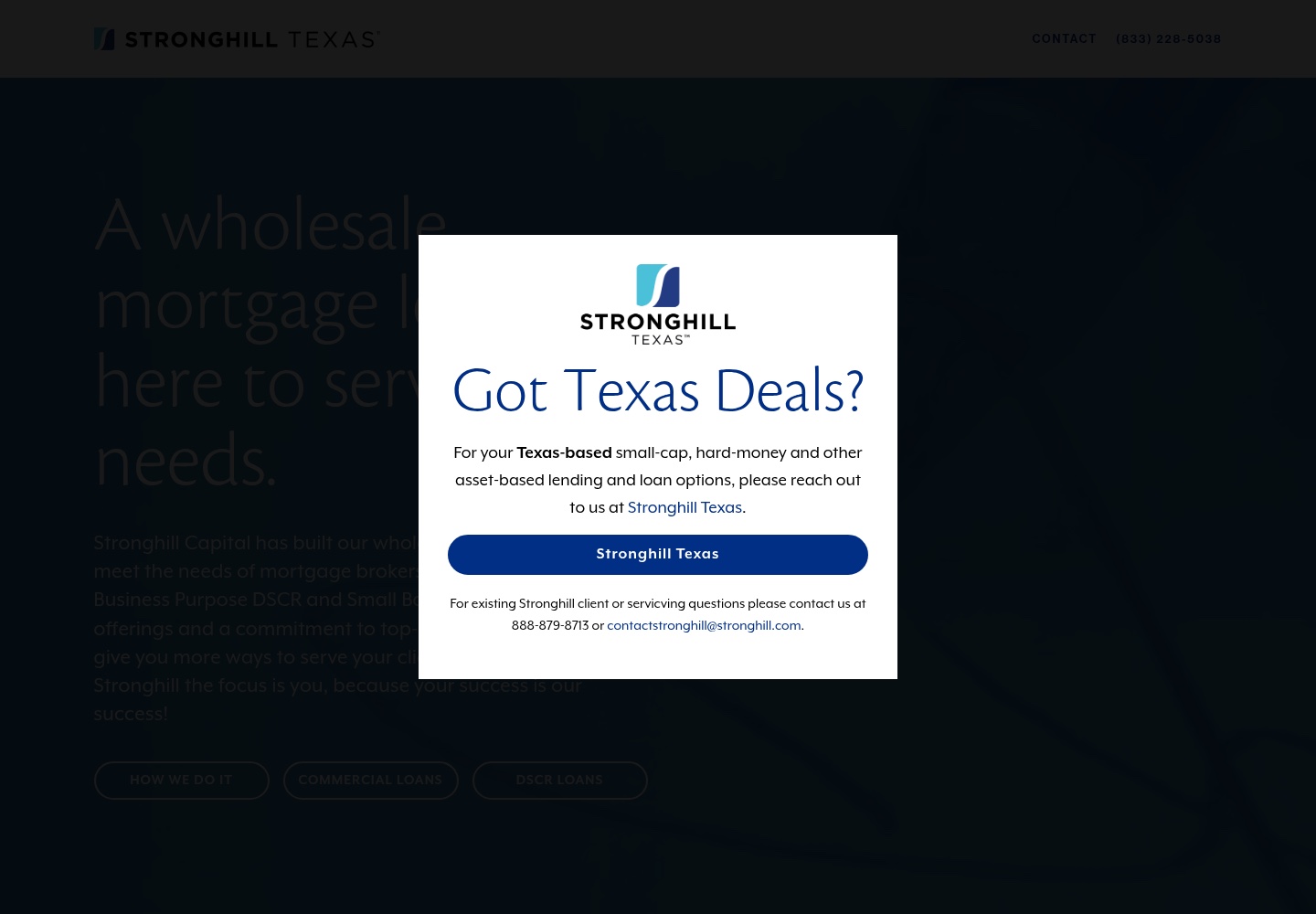
The two dated references show a visible shift in emphasis: from an archived page with many navigation and content signals competing for attention to a current public homepage that leads with a more focused mortgage proposition and a stronger visual hierarchy.
Before
After
The comparison establishes visible differences between two dated references. It does not prove that every current difference was solely created by Ivan, that the public site is unchanged from the delivered version or that the redesign produced a measurable business outcome.
07 / Credibility and conversion paths
Support evaluation before asking for action.
For a commercial lender, a call to action carries more weight when visitors can first place the company, understand the lending offer and see evidence of relevant work. The approved project source specifically calls out transaction proof, lending details and calls to action as part of the redesign objective.
This case study does not claim that the new sequence increased leads or conversions. It records the intended clarity of the path, not a measured commercial result.
08 / Visual system
Use clarity as a signal of confidence.
The redesign's visual direction gives a finance product more room to explain itself: stronger typography establishes the proposition, contrast separates layers of information and imagery gives the lending context a visible place without replacing the product story.
One primary proposition.
Visitors can orient themselves before choosing a lending or property path.
Make decisions scannable.
Product and proof sections need enough separation to remain legible across a dense business story.
Let content scale.
Product categories, property information and transaction modules can use consistent patterns as the site grows.
09 / Responsive experience
Keep the decision path intact on smaller screens.
Responsive design was part of Ivan's documented scope. The design direction treats positioning, product groupings, proof and action as a repeatable content order that can move from a wide composition into one readable column.
Keep the proposition and relevant product route ahead of supporting detail.
Preserve readable type and complete interface context rather than shrinking the desktop experience into a strip.
No dedicated mobile Stronghill screenshot is currently stored in the approved local asset set, so this section does not claim a specific captured mobile implementation.
10 / Design decisions
The redesign decisions were about making the next question easier to answer.
- 01
Start with audience intent
Problem: Brokers and borrowers can arrive with different questions. Decision: Organise the story so visitors can identify a relevant path before reading everything.
- 02
Separate commercial and DSCR context
Problem: Lending products can blur together when presented as one list. Decision: Give product distinctions a clearer place in the information hierarchy.
- 03
Bring proof closer to evaluation
Problem: Claims about lending need context. Decision: Make transactions and company information part of the journey toward an enquiry.
- 04
Use patterns that can scale
Problem: A growing lending site can become a collection of one-off pages. Decision: Establish repeatable structures for products, property categories and supporting content.
11 / Takeaway
A lending website earns clarity one decision at a time.
The Stronghill redesign was about turning a dense commercial lending story into a more deliberate sequence: understand the business, find the relevant product, see the proof and decide what to do next. The available evidence supports that design direction, while leaving performance and complete authorship of current surfaces unclaimed.
Let’s work together
Need a website that makes a complex business easier to understand?
Let's create a digital experience that helps people find the right information and next step.
[email protected]