Stretch Zone
Website Redesign · UX/UI
Making a wellness service easier to understand, discover and access.
Stretch Zone is a practitioner-assisted stretching brand with a large franchise footprint. I worked on the website redesign to make the method easier to understand, strengthen location and booking journeys, and present the brand in a more contemporary way.
01 / Overview and contribution
Explain the method before asking people to choose a location.
Stretch Zone's website has to introduce a service, make its approach understandable and help visitors take a relevant next step. The redesign work focused on that sequence: clarify the method, present the brand with more confidence, then support location and booking journeys.
- Project
- Stretch Zone
- Type
- Website Redesign
- Role
- Website redesign · UI/UX · Responsive design
- Industry
- Wellness / Fitness Services
- Location
- Fort Lauderdale, Florida, USA
- Website
- stretchzone.com ↗
02 / The original experience
A service-led experience with several next steps in view.
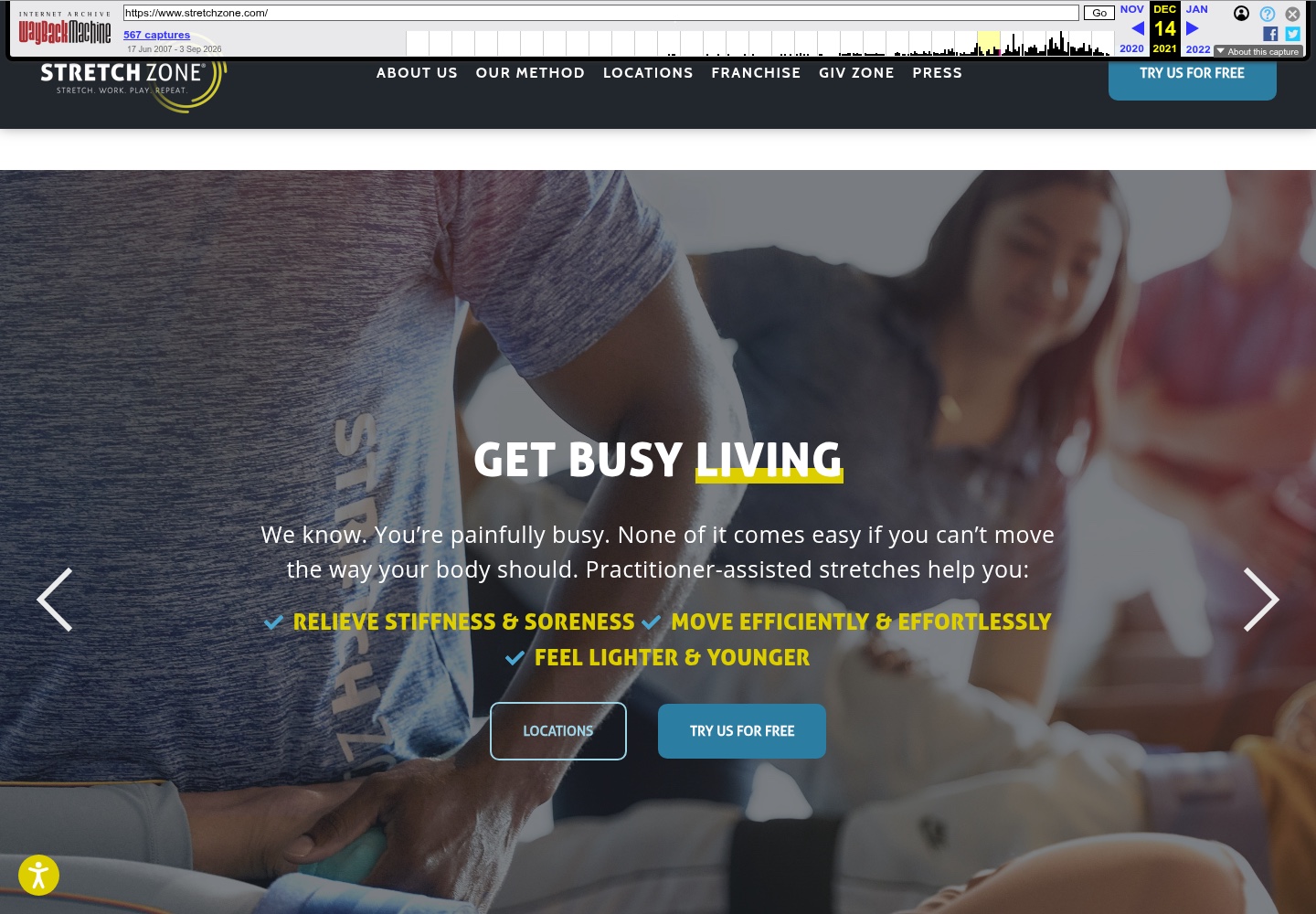
The archived December 2021 homepage led with a bold service proposition, a short explanation and two prominent actions: Locations and Try Us for Free. Its navigation also exposed About Us, Our Method, Locations, Franchise, Give Zone and Press. This is historical context, not a claim that the earlier site was ineffective.
03 / The design challenge
Connect service understanding with the next step.
The approved project source describes a legacy experience where method, science, locations and booking actions competed for attention. The challenge was to keep the service credible and approachable while helping visitors understand what to do next.
Make the method legible
Turn a practitioner-assisted service into a clear proposition that can be understood before a visitor reaches a location page.
Keep action close to context
Let location and introductory actions appear where a visitor has enough information to decide whether to continue.
Scale across a network
Create a structure that can support a broad franchise footprint without making every local journey feel disconnected from the parent brand.
04 / Information architecture
A guided route from understanding to access.
The source-backed path below describes the experience priorities documented for the redesign. It is an editorial explanation of the visitor journey, not an invented sitemap or an assertion about the site's internal implementation.
- 01
Understand
Learn what the method is and why the service exists.
- 02
Evaluate
Find supporting method or science information when more context is needed.
- 03
Find
Move into location discovery when the visitor is ready to look nearby.
- 04
Take action
Choose an appropriate introductory, booking or inquiry path where available.
The archived and current references visibly expose location and introductory actions. The current reference also shows a Franchise route; its original delivery scope and attribution are not established by the available evidence.
05 / Before and after
From a bold service promise to a more method-led presentation.
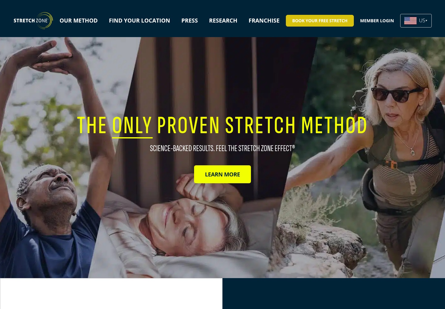
The dated references show an observable shift in emphasis: the archived page combines a lifestyle-oriented headline, benefit copy and location/free-trial actions, while the current local image gives the method, research language and a single Learn More action a larger stage.
Before
After
This comparison establishes visible differences between two dated references. It does not prove that Ivan designed every current difference, that the current site is unchanged from the delivered redesign or that the work produced a measurable booking or business result.
06 / Communicating the service
Give the method enough room to be understood.
The approved source frames service storytelling as a core redesign objective. The archive starts with “Get Busy Living” and a longer explanation of practitioner-assisted stretching. The current reference presents a shorter method-led message with supporting science language and a Learn More action.
These choices point to a useful hierarchy for a service brand: a visitor should understand the proposition first, then decide whether to explore evidence, find a location or take an introductory step. The page does not validate any health or medical claim shown in the public references.
State what the service is.
Lead with the method rather than making the visitor infer it from lifestyle imagery.
Offer depth on demand.
Keep supporting method and science information available without making the first view feel like a technical explanation.
Make the next step visible.
Use clear actions once the visitor has enough context to choose a location or introductory path.
07 / Location discovery and next actions
Make access part of the story, not an afterthought.
The archive exposes Locations and Try Us for Free in the hero. The current reference uses Find Your Location in navigation and pairs a free-stretch booking action with the service introduction. Together, the dated images show that access was treated as a primary part of the website experience.
Help visitors find the relevant studio.
Location discovery is a distinct intention, so it needs a visible route rather than being buried in supporting content.
Connect context to action.
Introductory or booking actions make more sense after the visitor understands what the service involves.
Keep other audiences visible.
The current reference includes a Franchise route, but the available evidence does not establish whether that was part of Ivan's delivered scope.
08 / Brand and visual system
Let the imagery make the service feel tangible.
The two dated references use strong photography to make an assisted service easier to picture. The archived experience layers a dark header, bright blue actions and yellow benefit accents over an in-session photograph. The current reference keeps a deep navy foundation, uses a high-contrast yellow action and gives the method-led headline a clearer central position.
Within the portfolio case study, these are observable hierarchy and presentation choices—not proof of a complete design system or of authorship for every current component.
Show the experience.
Use real service imagery to help visitors understand the kind of interaction being offered.
Make action readable.
Bright blue and yellow controls stand apart from the darker visual field at important decision points.
Separate promise from proof.
Let the main message establish the proposition before supporting method or research detail appears.
09 / Responsive experience
Keep the journey clear wherever it begins.
Responsive design was part of the documented role. The design objective is straightforward: preserve the order of the experience as the layout narrows—understand the service, access supporting context, find a location, then take the next step.
Keep the proposition and primary action ahead of supporting detail on a single column.
Keep location and booking labels readable rather than shrinking several competing controls into one crowded row.
No dedicated approved Stretch Zone mobile screenshot is currently stored, so this case study does not claim a captured mobile implementation.
10 / Design decisions
The redesign decisions were about sequence, not decoration.
- 01
Explain the method before the offer.
Problem: A service can feel abstract when the first view only shows lifestyle imagery. Response: Give the method and its supporting context a clearer role in the opening hierarchy.
- 02
Place location discovery near the proposition.
Problem: Visitors may understand the service but still not know how to access it. Response: Keep Locations or Find Your Location visible as a primary path.
- 03
Use progressive disclosure for depth.
Problem: Method and science information can add context while also increasing cognitive load. Response: Offer a clear invitation to learn more instead of placing every explanation in the first screen.
- 04
Design patterns that can scale.
Problem: A large franchise footprint requires consistency across locations and audiences. Response: Use repeatable responsive sections and recognizable action patterns without losing the parent brand.
11 / Takeaway
A service becomes easier to access when its story has a clear order.
The Stretch Zone redesign was about connecting three needs: understand the method, find a relevant location and choose an appropriate next step. The available evidence supports a clearer product-story direction; it does not support claims about bookings, franchise growth or health outcomes.
Let’s work together
Need a website that makes your services easier to understand?
Let's create a digital experience that gives your service, your story and your customers' next step equal attention.
[email protected]