Hoffman's Chocolates
Website Redesign · E-commerce · UX/UI
Reframing a chocolate brand's online experience around heritage, gifting and easier ways to shop.
Hoffman's Chocolates is a South Florida chocolate brand with a long retail history. I worked on the redesign to reduce promotional clutter, give the brand story more space and simplify how customers discover products, gifting and stores.
01 / Overview and contribution
Make the brand easier to shop without flattening its character.
Hoffman's Chocolates is a South Florida consumer brand whose website has to do two jobs at once: express what makes the brand distinctive and help visitors find a product, gift or store. The redesign work treated the storefront as an editorial and shopping experience, not a stack of offers.
- Project
- Hoffman's Chocolates
- Type
- Website Redesign
- Role
- Website redesign · UI/UX · E-commerce
- Industry
- Consumer / E-commerce
- Location
- South Florida, USA
- Website
- hoffmans.com ↗
02 / The original experience
A storefront with plenty of ways to begin.
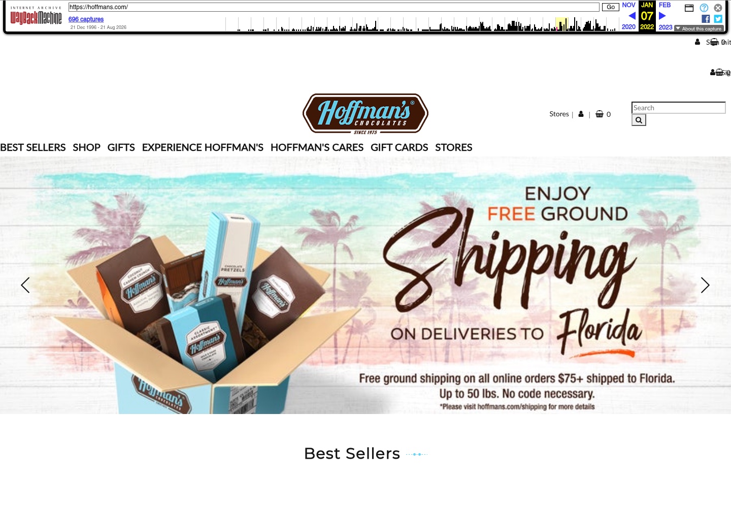
The archived January 2022 homepage visibly led with Best Sellers, Shop, Gifts, Experience Hoffman's, Hoffman's Cares, Gift Cards and Stores. It also combined a large promotional banner with product and shopping controls. That is useful historical context, not a claim that the earlier site failed commercially.
03 / The design challenge
Bringing brand storytelling and shopping into balance.
The approved project source describes an experience that was busy with banners, promotions and product modules. The design challenge was not to remove the commercial purpose of the site, but to create a calmer order in which brand, product and purchase pathways could support one another.
Protect the heritage
Give the brand's history and South Florida identity room to contribute to the buying experience.
Reduce competing signals
Make promotions and modules easier to scan so the storefront feels considered rather than crowded.
Clarify the ways to buy
Help visitors move between product discovery, gifting, online shopping and store information.
04 / Information architecture
Let each entry point answer a different shopping intention.
The source-backed structure below describes the relationship between the brand story and the site's main shopping pathways. It is an editorial explanation of the case study, not an invented sitemap or claim about the underlying commerce platform.
- 01
Brand
Understand the heritage, place and character behind the chocolate.
- 02
Products
Browse best sellers and product categories through clearer discovery.
- 03
Gifting
Find a relevant way to shop for an occasion or recipient.
- 04
Stores
Locate an in-person path when online shopping is not the goal.
05 / Before and after
From promotional density to a more deliberate first impression.
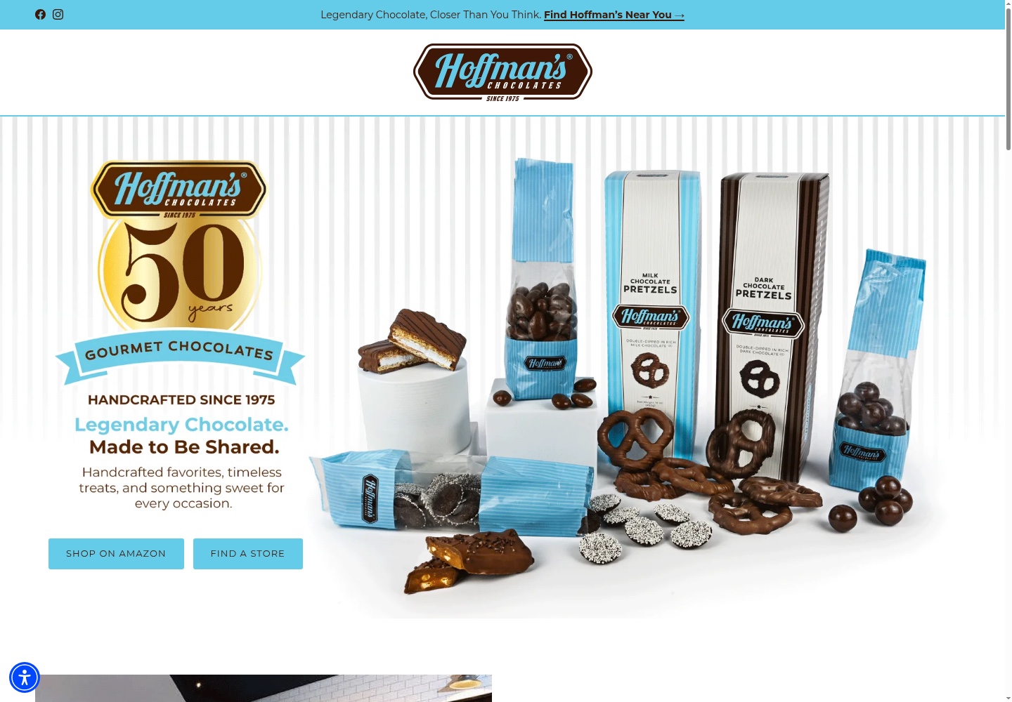
The dated references show an observable shift in emphasis: the archived homepage is led by a shipping promotion and many top-level shopping destinations, while the current local image gives the heritage message and product photography a larger, calmer stage.
Before
After
This comparison establishes visible differences between two dated references. It does not prove that Ivan designed every current difference, that the current site is unchanged from the delivered redesign or that the work produced a measurable sales result.
06 / Brand heritage
Let history do work inside the storefront.
The approved source identifies heritage and South Florida identity as part of the buying experience. The current local image also visibly carries the “Since 1975” mark and a 50-year anniversary message. Those details are treated here as visible brand evidence; any final historical wording or anniversary claim should still be confirmed by Ivan before publication.
That balance matters because heritage is not a detached “About” story. It can set the tone for how products are presented, why gifts feel meaningful and how the brand earns attention before a visitor chooses a purchase path.
07 / Product discovery and gifting
Make the chocolate the primary content.
The redesign direction simplifies the routes around product discovery, gifting, online purchase and store finding. The available evidence supports the role of product photography and clearer entry points; it does not support claims about a particular checkout flow or sales outcome.
Start with what people came to find.
Best Sellers and shopping categories should be easy to reach without competing with every promotion at once.
Frame the occasion.
Gifting is a distinct intention, so it deserves an identifiable route rather than being buried among general product links.
Keep stores visible.
Store discovery supports visitors who want the brand in person, not only through an online order.
08 / Visual system and photography
Warmth comes from focus, not decoration.
Product imagery, typography, whitespace and brand color work together to make the storefront feel more generous. The current reference uses a light, product-led composition that lets packaging, texture and the heritage message share the frame.
Let the product carry the mood.
Large, readable imagery gives the chocolate a role beyond thumbnail decoration.
Separate story from offer.
A clear headline can establish the brand before shopping actions take over.
Give the eye a pause.
Less competing content helps visitors scan products and occasions with more confidence.
09 / Responsive experience
Keep product discovery generous at every size.
Responsive design was part of the documented scope. The design direction treats the brand message, shopping routes and product imagery as content that should re-order cleanly rather than shrink into a crowded desktop composition.
Keep the brand proposition and primary shopping route ahead of supporting detail on a single column.
Preserve the product context and readable action labels when the large composition narrows.
No dedicated approved Hoffman's mobile screenshot is currently stored, so this page does not claim a captured mobile implementation.
10 / Design decisions
The redesign decisions were about making room for both meaning and purchase.
- 01
Reduce promotional clutter
Problem: Banners, offers and product modules competed for attention. Decision: Create a calmer first impression with a clearer reading order.
- 02
Elevate the heritage story
Problem: A long-standing brand can become indistinguishable from a generic storefront. Decision: Bring history and South Florida identity into the main experience.
- 03
Use product-led visuals
Problem: Chocolate is experienced visually before it is purchased. Decision: Give product photography more scale and breathing room.
- 04
Clarify shopping intentions
Problem: Buying for oneself, gifting and finding a store are different tasks. Decision: Make those pathways visible without forcing them into one generic shop route.
11 / Takeaway
A stronger storefront makes the brand and the product feel like the same story.
The Hoffman's redesign was about removing enough noise for the brand's character, product photography and buying pathways to support one another. The evidence supports a more deliberate shopping experience; it does not support claims about sales, conversion or customer behaviour.
Let’s work together
Need a website that brings your brand and business together?
Let's create a digital experience that gives your story and your customers' next step equal attention.
[email protected]